This guide is part of our series on AI for branding and design.
Three accessibility problems show up on almost every site we review: text colors that do not contrast enough with their background, images with missing or useless alt text, and headings that skip levels or are used for styling. All three affect people using screen readers or low vision settings, and all three affect how well search engines understand a page. AI can find them across a whole site and draft most of the fixes.
Automated checks catch only part of what a full accessibility review covers. Keyboard navigation, focus order, forms and screen reader testing need a person.
What you need
- An AI assistant that accepts file uploads, such as Claude
- The site’s color palette or design tokens
- A crawl export from Screaming Frog with image URLs, alt text and headings per page
- A contrast checker, such as WebAIM’s, to confirm results
Step 1: Check color contrast
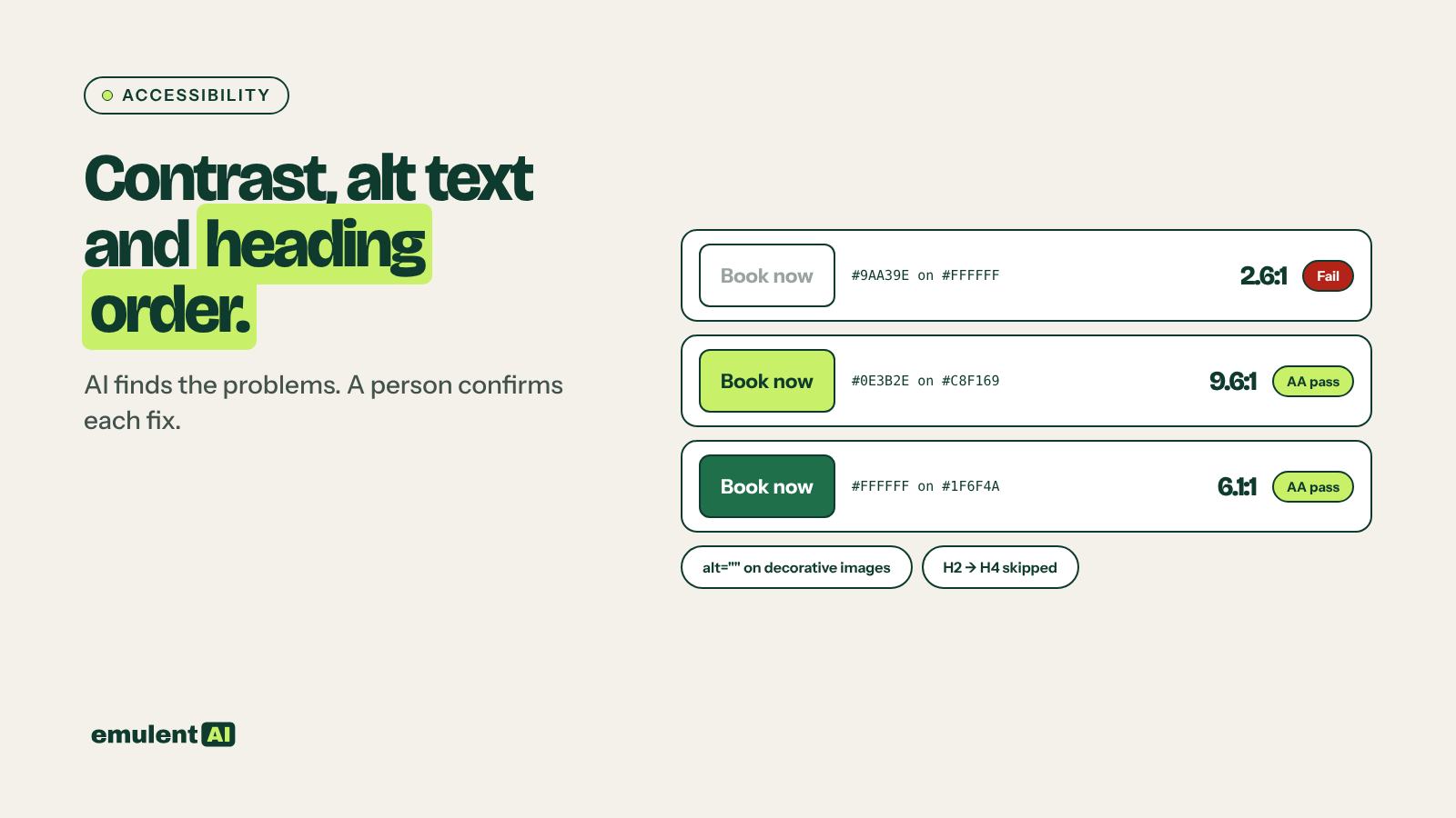
WCAG 2.1 and 2.2 at level AA require a contrast ratio of at least 4.5:1 for normal text and 3:1 for large text (about 24px, or about 19px bold) and for interface elements such as button borders and form fields. Give AI every text and background pair the site uses:
Here are the text and background color pairs used on our site, with where
each is used and the font size. Calculate the contrast ratio for each pair
and mark it pass or fail against WCAG AA for its text size. For each fail,
suggest the smallest change to the text or background color that passes,
keeping the hue as close to the original as possible. Show the new ratio.
AI arithmetic can be wrong, so confirm each failing pair and each suggested fix in a contrast checker before changing the site.
Step 2: Write alt text in bulk
Export every image with its page URL and current alt text. Ask the AI to flag images with missing, filename-style or keyword-stuffed alt text, then to write new alt text for the flagged images from the image and the page context. Decorative images get empty alt text (alt=””), so screen readers skip them. Our guide to writing image alt text at scale covers the full workflow.
Step 3: Fix heading order
Attached is the heading outline (H1 to H6, in page order) for every page on
the site. Flag:
1. Pages with no H1 or more than one H1
2. Skipped levels, such as an H2 followed directly by an H4
3. Headings used for styling instead of structure, such as a
   one-word H3 used as a label, or a heading with no content after it
Group by URL and suggest the corrected level for each heading.
Many themes and page builders let you set a heading’s HTML tag separately from its visual size. Fix the tag to match the outline, and keep the look with the size setting.
Step 4: Check the rest by hand
Tab through the main pages with the keyboard and make sure every link and button is reachable and visibly focused. Submit each form with errors and check the messages make sense. Try the main pages with a screen reader for ten minutes. These checks find problems no crawl will.
Checks before you call it done
- Retest every changed color pair after the change goes live.
- Read a sample of AI-written alt text on the page. Alt text that is accurate but irrelevant to the page does not help.
- Keep a record of what was checked, when, and what was fixed. If accessibility ever becomes a legal question, that record is useful. For legal advice, talk to a lawyer.
Contrast fixes belong in your design tokens, so they carry through every new page, and heading problems often show up first in a brand consistency audit.
Put this to work with Bill.
Tell Bill about your next brand or website project. He’ll tell you which of these jobs to hand to AI first.
Contact Bill directly
Or call 773-791-3197